Mobile Design: White-Label Walking Tour App
User Research, Information Architecture, Product Design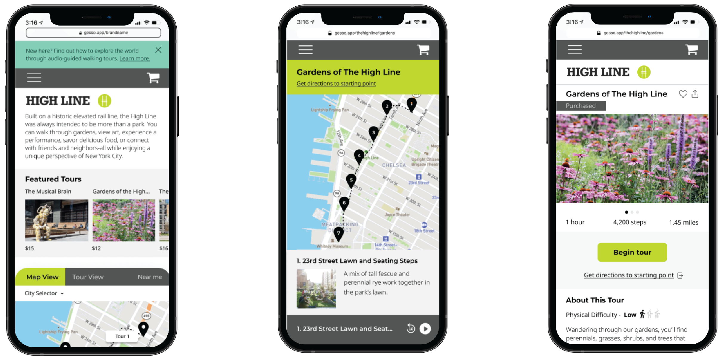
Abstract
Gesso is a platform for seekers and roamers that provides guided walking tours from New York to Tbilisi. They currently offer a native application that superimposes tours within a scalable map to help explorers find immersive tour experiences off the beaten path in their area.
Throughout this project, my team and I worked with Gesso to design a new white-label mobile application that would bring all the best features of their native app to an in-browser experience. This would open the doors to a new subset of content creators who could use Gesso’s engine to power their own unique tour content, as well as erase the barrier for a wider base of consumers who could find, purchase, and experience these walks without first needing to know about Gesso or having downloaded the mobile app.
Throughout this project, my team and I worked with Gesso to design a new white-label mobile application that would bring all the best features of their native app to an in-browser experience. This would open the doors to a new subset of content creators who could use Gesso’s engine to power their own unique tour content, as well as erase the barrier for a wider base of consumers who could find, purchase, and experience these walks without first needing to know about Gesso or having downloaded the mobile app.
︎ Research Methods
︎ Design Tools
- User Interviews (6)
- Moderated Usability Test (6)
︎ Design Tools
- Figma
- FigJam
- Adobe Illustrator
Client Goals
During our initial meetings with the client, we identified three objectives that were essential to our research and design methodology. It was clear they wanted a white-label product (one that clients can rebrand to pass off as their own) to create an ecosystem of content creator clients and their customers who would be become excited about using Gesso.
Specifically, we discussed:
Working within a three-person team, I conducted user interviews, built our user personas to represent our findings, designed and executed guerilla-style usability testing on our prototype involving simulated tours, designed screens in Figma, and interfaced directly with the Gesso team to determine project scope and present our final product.
Specifically, we discussed:
- Opening the market to connect content creators with their customers
- Creating a system to facilitate tour purchases (previously all tours were free and created by Gesso’s team)
- Increasing Gesso’s native app downloads and their growing their user base
Working within a three-person team, I conducted user interviews, built our user personas to represent our findings, designed and executed guerilla-style usability testing on our prototype involving simulated tours, designed screens in Figma, and interfaced directly with the Gesso team to determine project scope and present our final product.
Discovery Phase
Before diving into a redesign, we began researching the product -- testing the native app as potential users. It felt important to learn about the product by immersing myself in it. To this end, I took their guided tour through Brooklyn’s Prospect Park one night with a friend to get a sense of the user experience. Besides accidentally finding an envelope with $1000 in it during the walk (a story for another time), I learned a lot from this cursory test.
My teammates and I met back up to compare notes the following week, and we talked with our classmates and the Gesso team about app’s design strengths and potential usability pain points.
Next, we interviewed candidates who fit the profile of potential users. Were they familiar with audiotours? Would they be interested in this platform? How would they approach using this app?
We created an affinity map on FigJam to compile our results and create three main user groups, with journey maps relevant for each.
Personas
Who are our users?
The Newcomer:
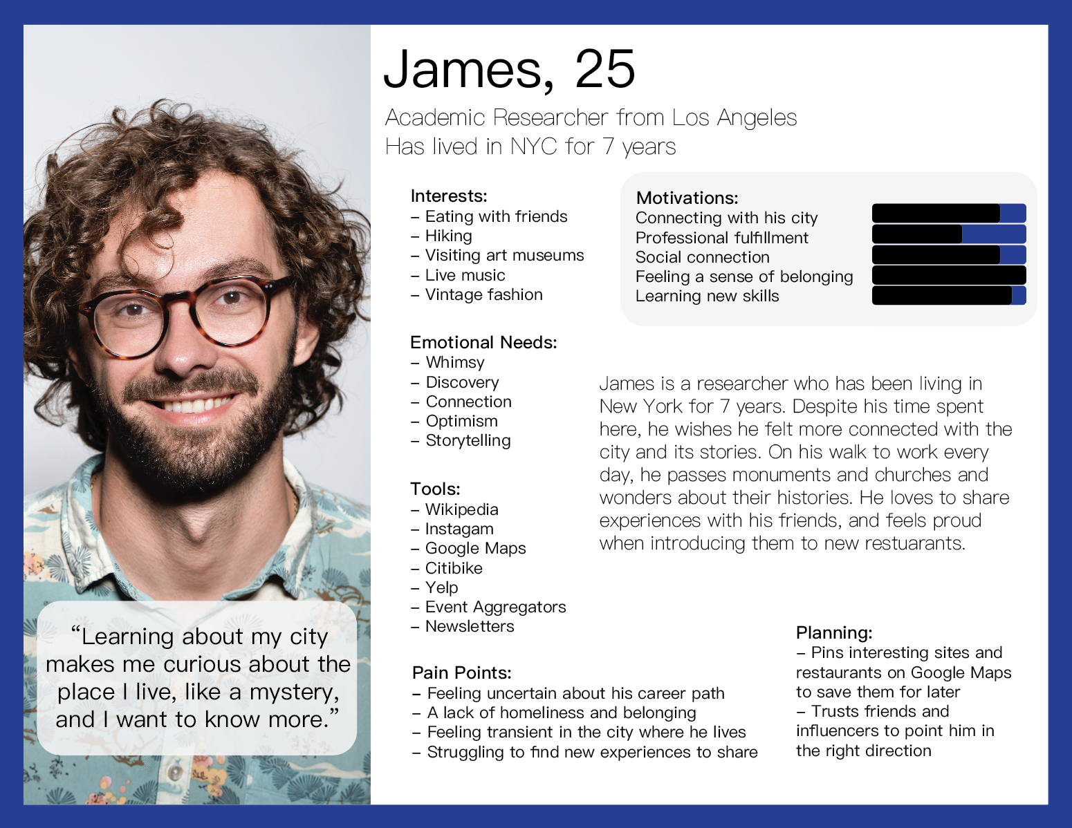
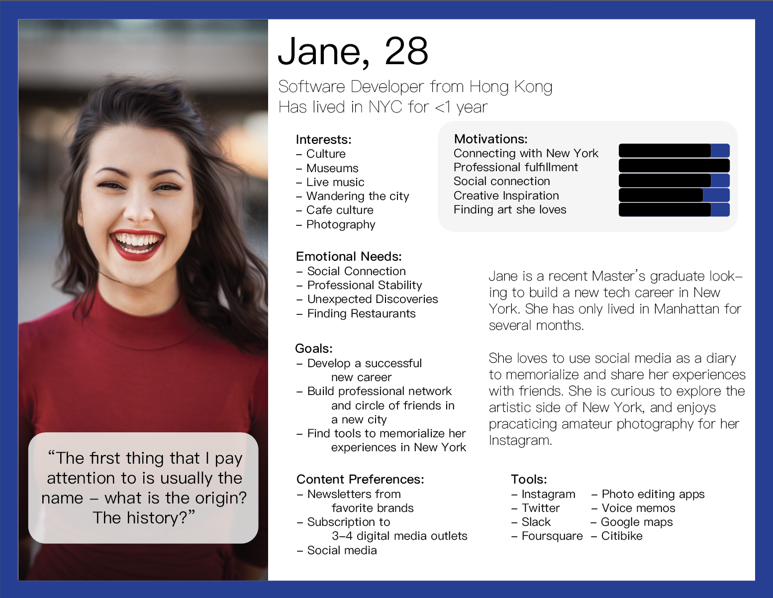
Jane: new to New York, she wants to find out what the city has to offer in the form of tourist attractions. She is interested in both planned and spontaneous experiences to discover.
The Local:
James: wants to find experiences to deepen his connection with his city, prefers unplanned, spontaneous excursions.
The Globe Trotter:
Kim: intends to search out tours in advance while planning trips to new cities.


Journey Mapping
What features should we provide?
Here I have included a user journey modeled from our interviews. This represents the Globe Trotter persona, Kim, in planning a trip to Paris.
Mapping user journeys is an essential step to understanding how users move through a process step-by-step, and helps us design a product with functionality that can help at each stage.
Information Architecture
How should we structure a prototype?
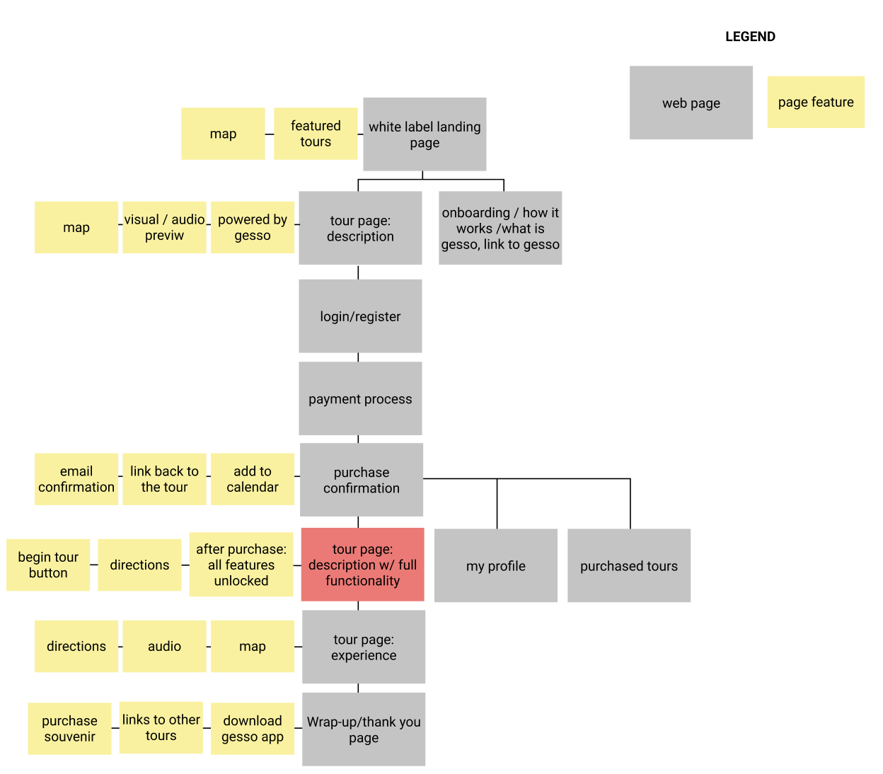
It outlines the key features necessary at each stage of the user journey in yellow and the corresponding pages where these features would live in gray.
It encapsulates the flow of a user navigating to the landing page, browsing available tours, registering, purchasing, accessing a tour, and returning to the main page where they are directed to the Gesso native app and ecommerce platform.
Designing for White-Label Clients
During our first stab at the design process, we consolidated our findings from user research to establish the key insights that drove us forward.
To this end, we imagined two prospective clients to use as models for our white-label prototypes:
Design Priorities:
- Create an experiece that draws in users unfamiliar with Gesso (who might have found the white-labeled product on a partner’s website, social media, or on a QR code).
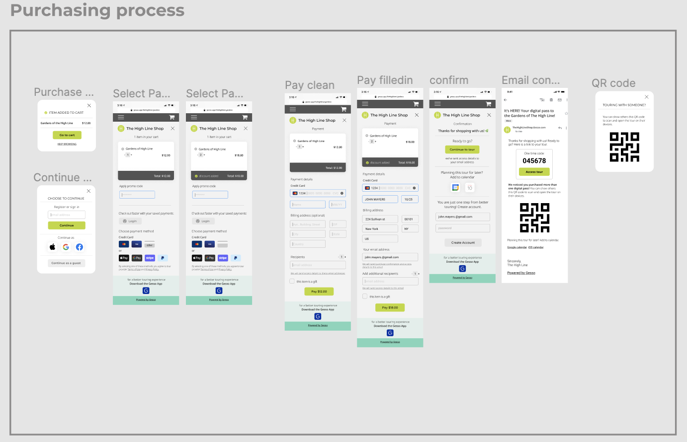
- Create a payment process that feels trustworthy and in which registration is not an obstacle to browsing and accessing tours.
- Ensure that users can find more information about Gesso and the native application during their visit.
To this end, we imagined two prospective clients to use as models for our white-label prototypes:
- The High Line, an elevated rail line-turned-park-turned-art-walk in Manhattan’s Chelsea neighborhood.
- Bowery Boys, a local company offering both walking tours and a podcast exploring little-known episodes of New York’s history.
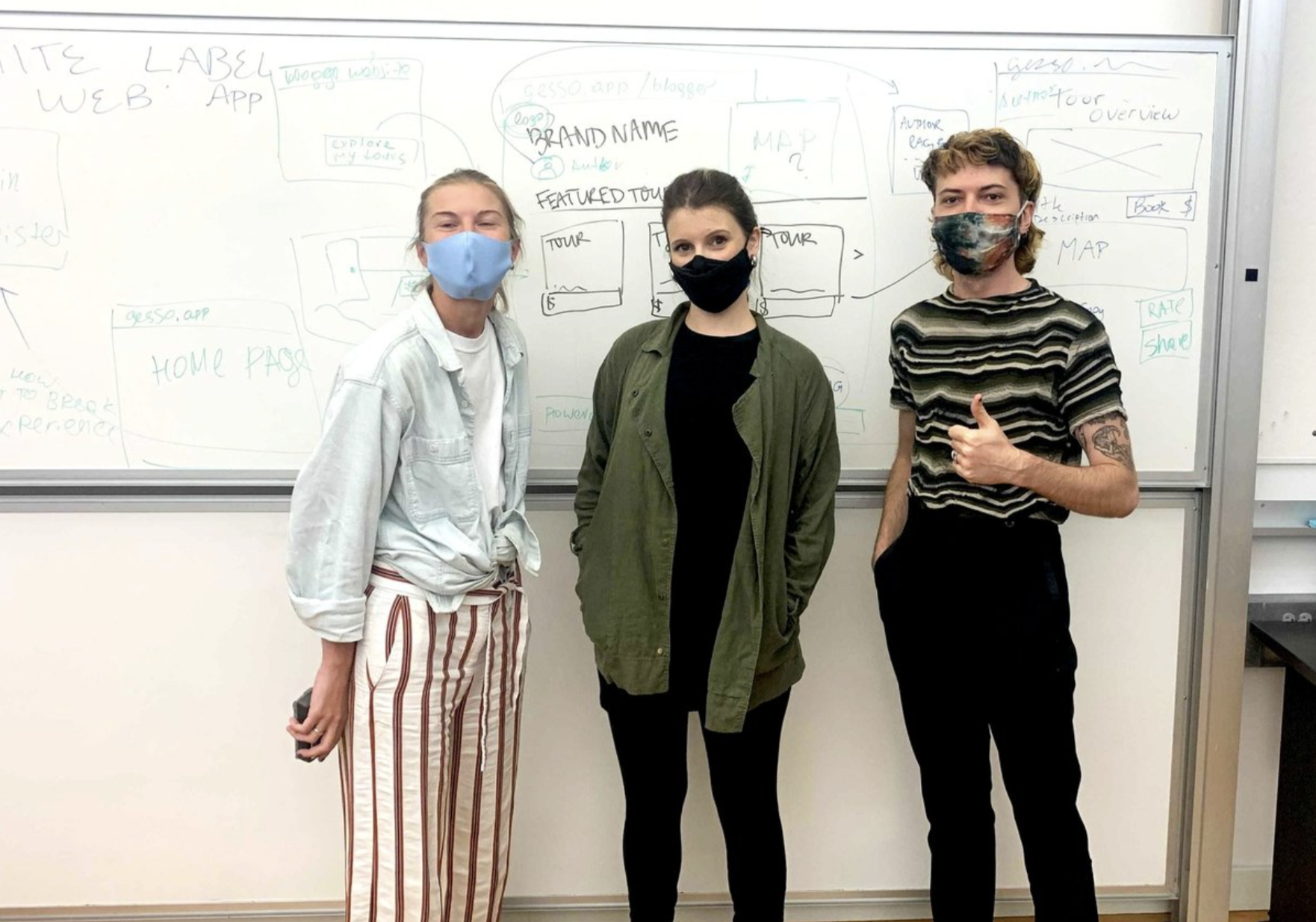 My team :)
Wireframing
Interactive prototype: feel free to browse through the various frames above
Given a tight timeline, we jumped right in to quickly build out wireframes and a medium-fidelity prototype. Our goal at this stage was to have a demo that we could use to test with actual users.
To the left, you can take a interact with our medium-fidelity prototype for the Bowery Boys demo in Figma.
This flow simulates the experience of a user planning and purchasing a tour after having been directed to our product from the client’s website.
Doing it live:
Guerilla Testing our Prototype
Moderated mobile usability testing
Once we had a completed two versions of our product to simulate distinct flows that arose from our research, we set out to test them with actual users to get actionable feedback.
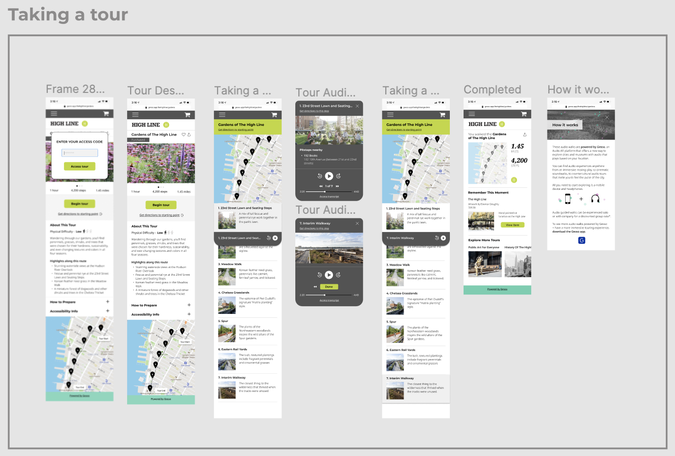
The first flow imagined users being directed to a specific tour page on their browser through a QR code on the High Line, and involves the process of purchasing and embarking on the tour itself, step-by-step.
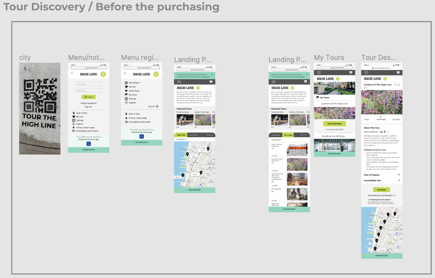
The second flow served to test how users could browse through a client’s available tours and purchase one to save for the future.
This was a really fun challenge -- we decided to simulate real walking tours for each of the flows out in the streets of New York. I’m definitely not trained in being a tour guide, but had a great time with this one.
Each session included pre- and post-test questionnaires and interviews to gauge feedback, determine impressions and pain points.
Each session included pre- and post-test questionnaires and interviews to gauge feedback, determine impressions and pain points.

Us, basically. Definitely on target.
Flow 1: Spontaneous (unplanned) tour of the High Line
Task:
“You live in NYC and are enjoying a leisurely afternoon running errands in Chelsea. On your journey, you spot a sign by the entrance of the High Line with a QR code for a walking tour. It’s a nice day out, and you were just thinking about how you’ve never spent time exploring the High Line. You have a friend meeting up with you so you want to do the walking tour together.”
Flow 2: Purchasing and saving a tour for the Future (Bowery Boys)
Task:
“You just arrived in NYC, it's your first time in the city. In the taxi cab on the way from the airport to the hotel you are scrolling though some NYC social media blogs, searching for tips where to do and what to see. In your Instagram feed you see an ad about the walking tours narrated by the Bowery Boys. You have a few hours free tomorrow, and the weather seems to be nice, you are thinking of exploring tours. Go ahead, check their tours and book one now to have you all set for tomorrow.”
Key Insights
Users were hesitant to create an account.
- One of the biggest pieces of feedback we heard was key to our understanding of how a white label web app would differ from the preexisting product. We needed to create a way for unregistered users to access and browse through content, while at the same time being able to save tours for later, purchase them, and add them to a purchased tours collection.
- Users did not see the need to create an account for a white-label client’s app. Nearly all of our participants were confused if they would be creating an account for Gesso, the white-label client, or both.
Users wanted earlier prompts for app downloads.
- In our initial tests, we sent users emails that contained their purchased tours and redirecting users to Gesso’s app at the end of their exerience. However, our participants reported that they had very little incentive to download the app that late in the process. We ultimately decided to include modals during the purchasing flow to prompt users to download the Gesso app.
Users often required a non-linear touring experience.
- For both the spontaneous and planned tours, users reported that they would be unlikely to complete the tour start-to-finish all in one go (especially if the tour was in a metropolitan area). They would want a tour player that allows them to play/pause, stop, exit, and reopen the experience to accomodate whimsy and flexibility.
With these in mind … essential considerations for the prototype included the following:
Core Information Architecture:
-
Important pages included: login/registration, tour description, the checkout flow and content creator info pages
Landing mechanisms:
-
How would users arrive? We considered how these flows would look for users coming from third-party websites (like blogger pages) and physical environments like QR codes
Other UI and functionality:
-
Designing pages that can be not only customized with branding, but can easily scale for a range of creators: from small bloggers and large corporate clients
-
Adding a “powered by Gesso” footnote throughout the experience
-
Allowing users to interact with the tours by adding to favorites, rating and sharing
-
Incorporating prompts to download the Gesso native app
Our Prototype
Here I’ve included the high-fidelity prototype we presented to the Gesso team, as well as a panel of UX professionals, faculty members, and students.
