Responsive Site Redesign
Research, Information Architecture, Interface Design

Abstract
Client Goals
Founded in 2020, Variable West is an event hub for users interested in the West Coast’s artistic microcommunities. This site’s calendar aggregates events across California, Oregon, and Washington featuring information about exhibitions, performances, screenings, lectures, reviews, essays, and more.
My three-person team redesigned the site (previously a basic Wordpress plugin) to establish a design system, incorporate advanced filtering & search features, and add functionality to help users discover relevant events and submit content.
This redesign aimed to increase traffic, foster community, and draw paying subscribers to the site. In our initial meetings with the client, we identified three long-term goals:
- Become an essential resource for galleries, museums, and other organizations to list their events and increase their reach.
- Assist writers, artists, curators, and other art lovers (or art likers) in finding art events they want to attend.
- Expand editorial programming, including publishing user-submitted eviews, interviews, and essays with more frequency.
︎ Research Methods
︎ Information Architecture
︎ Design Tools
- Email Questionnaires (27)
- User Interviews (6)
- Moderated Usability Test (6)
- Heuristic Evaluation (3)
- Competitive Analysis
︎ Information Architecture
- Affinity Mapping
- Card Sort
- Tree Test
︎ Design Tools
- Miro
- Paper Prototyping
- Marvel App
- Adobe XD
Discovery Phase
Our client provided us with guesses about who would be using the site, but they hadn’t done any research to justify their assumptions. We began the project by distributing questionnaires to potential users with a demonstrated interest in the arts. We recruited respondents from local art schools. The questionnaires asked about their involvement in arts communities, how often they went to exhibitions, and how they find relevant events that interest them. The survey also asked users to navigate the Variable West site to gauge their initial feedback.
We also remotely interviewed users who were familiar with the site to glean more insight. To accomplish this, users performed a moderated think-aloud walkthough of the site.
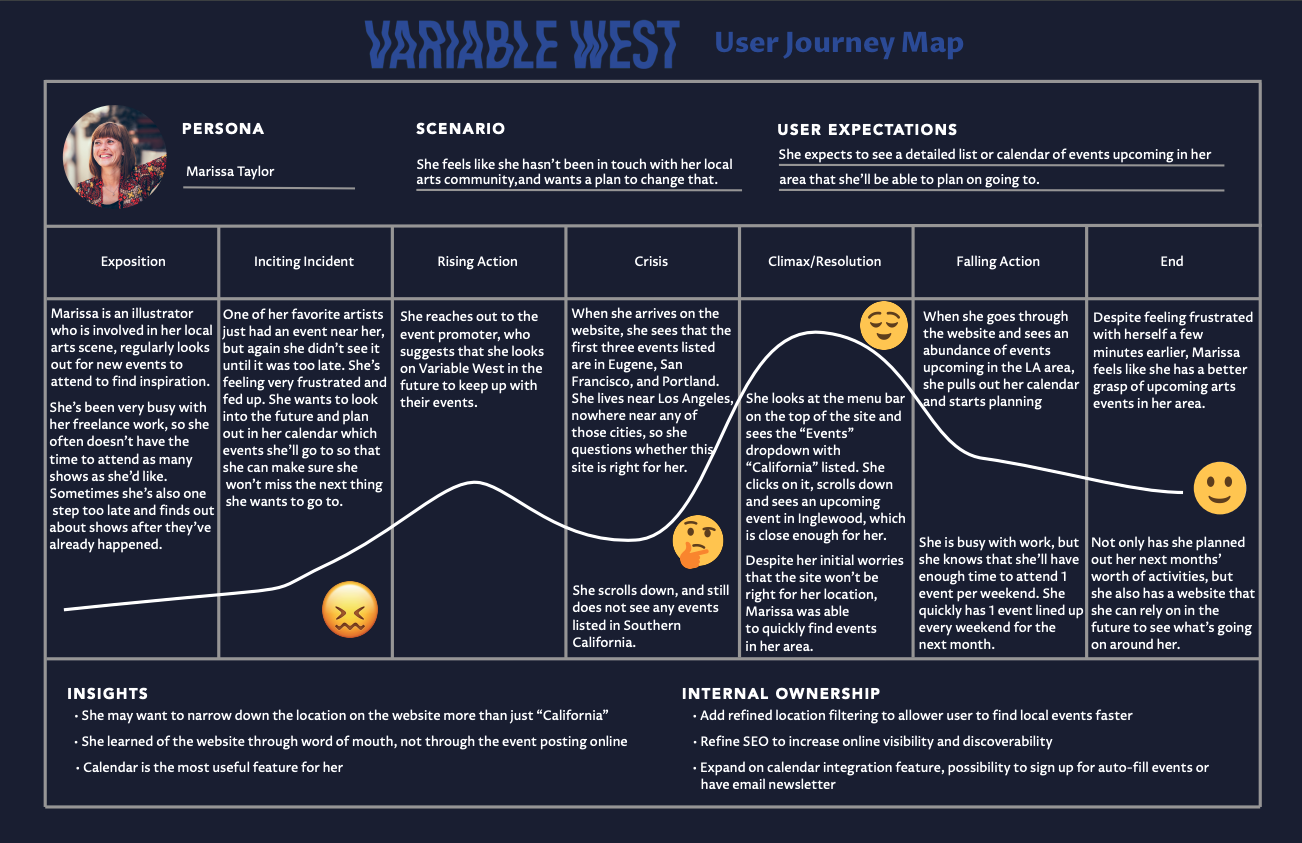
Pulling data from these sources, we compiled an affinity map to code the feedback into focus areas using Miro. Upon compiling these insights, we built two personas and a journey map to model primary users.
We also remotely interviewed users who were familiar with the site to glean more insight. To accomplish this, users performed a moderated think-aloud walkthough of the site.
Pulling data from these sources, we compiled an affinity map to code the feedback into focus areas using Miro. Upon compiling these insights, we built two personas and a journey map to model primary users.
User Research
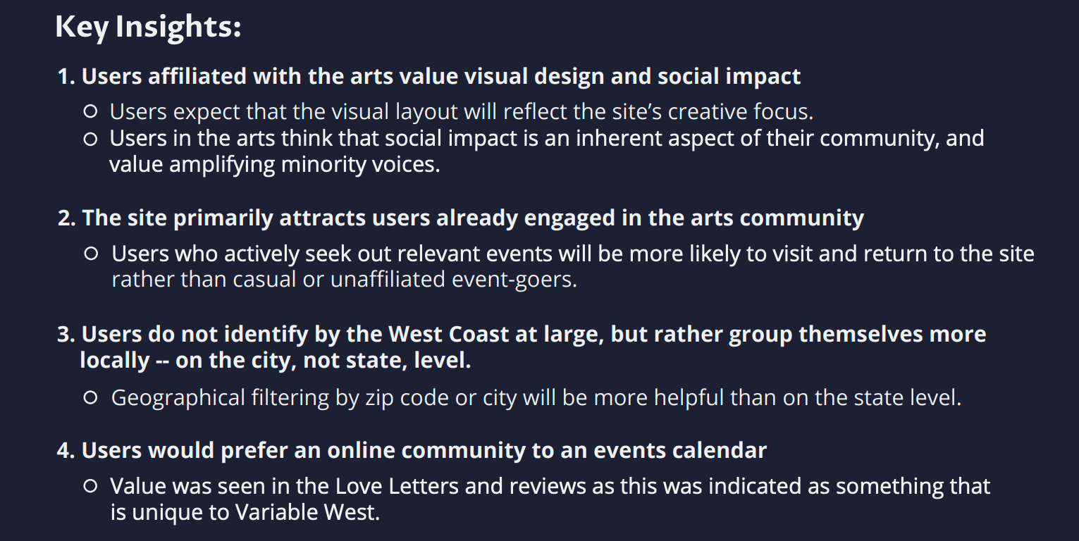
Key Insights
- Users prioritize visual design and social impact.
- Art fans identify with their city, not their state (or coast).
- The editorial content and community events are high value.
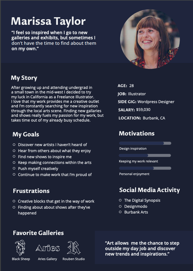
Personas
Primary:
Marissa Taylor: an illustrator who wants to discover new local artists, find creative inspiration, and build community with others who share her interests.
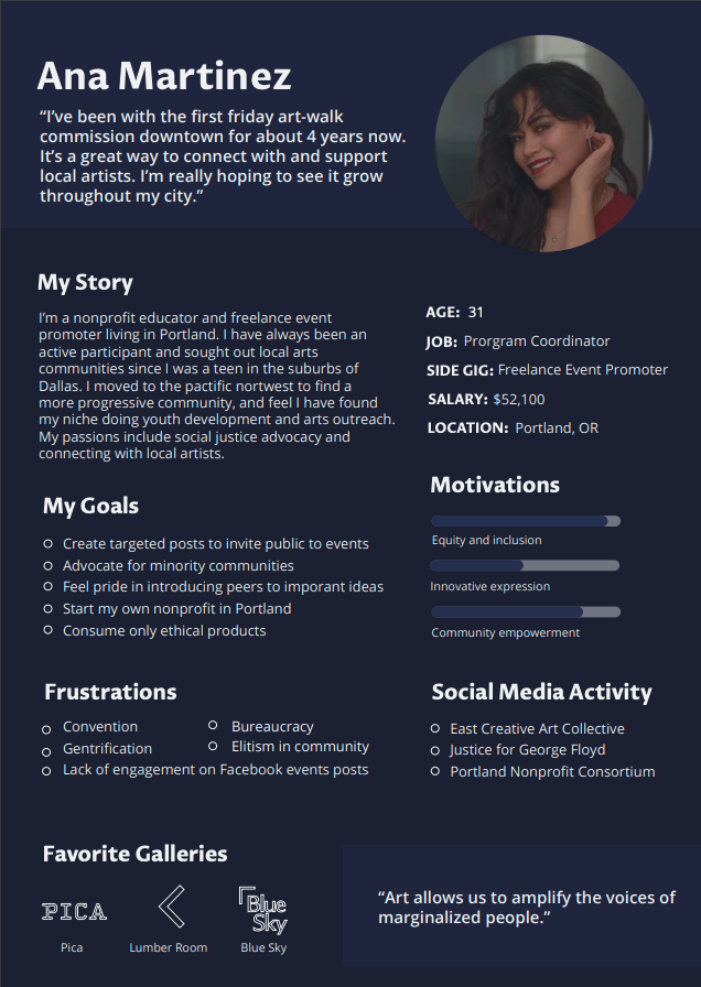
Secondary:
Ana Martinez: a freelance event producer looking to engage broader audiences with her work.
Heuristic Evaluation
Once we had established a strong sense of who our users were and what they wanted to get out of the website, I conducted cursory usability testing in a heuristic evaluation.
I recruited three evaluators to perform four tasks on the site during 30 minute sessions and make note of any pain points or usability errors they encountered. This research informed our approach to redesigning site functionality.
Design recommendations from our findings:
- Organize posts by improving chronological and local event filtering.
- Integrate event mapping to visualize event locations.
- Ensure that relevant information is available and fully discoverable.
You can access the whole evaluation report by clicking here.
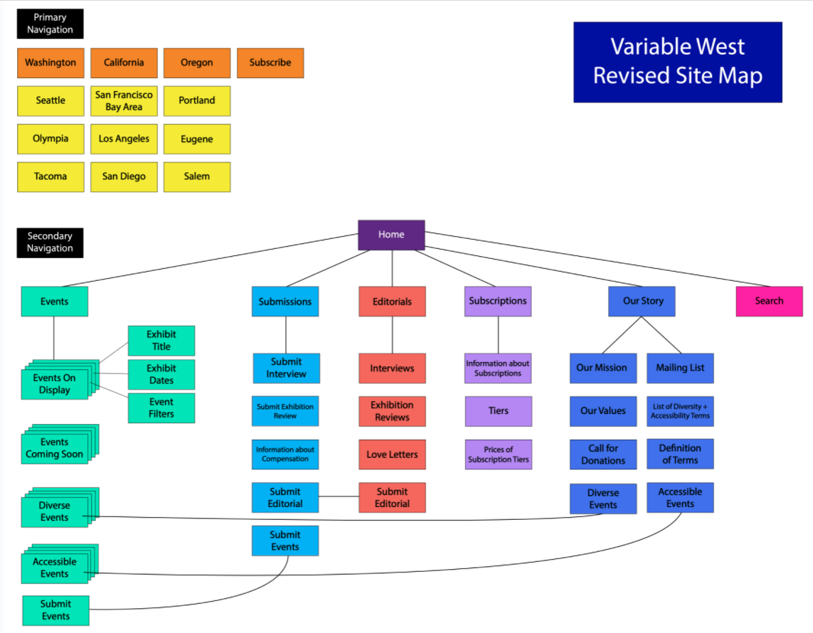
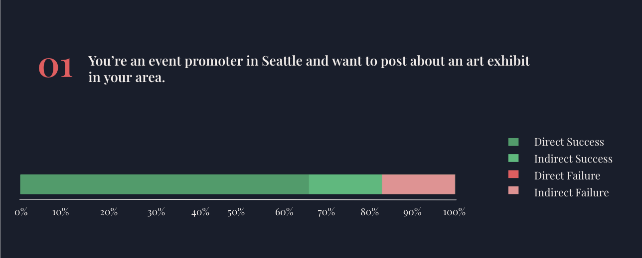
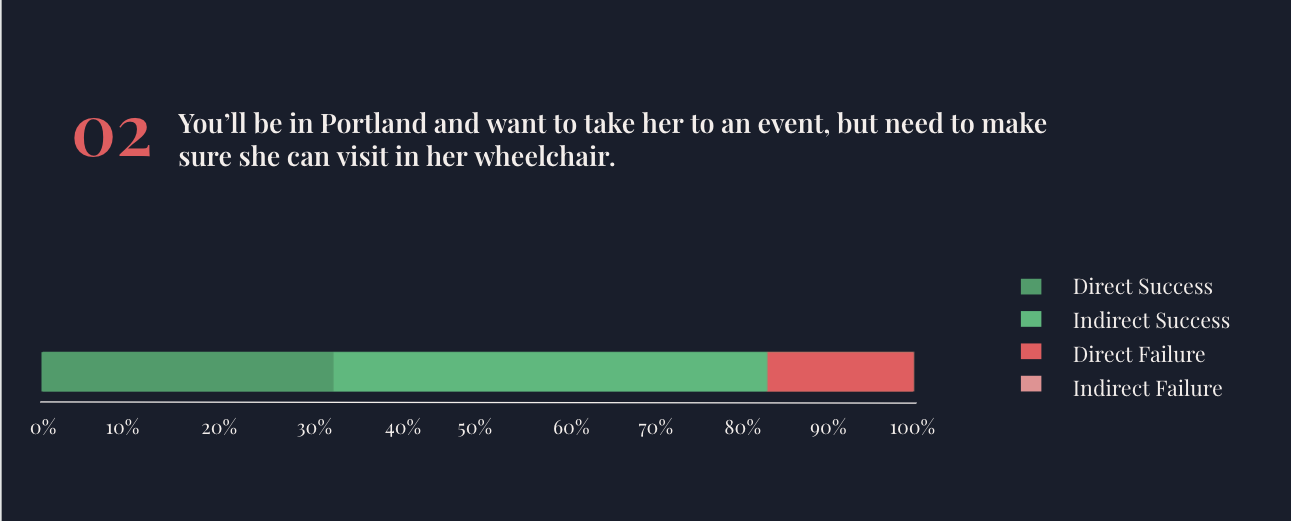
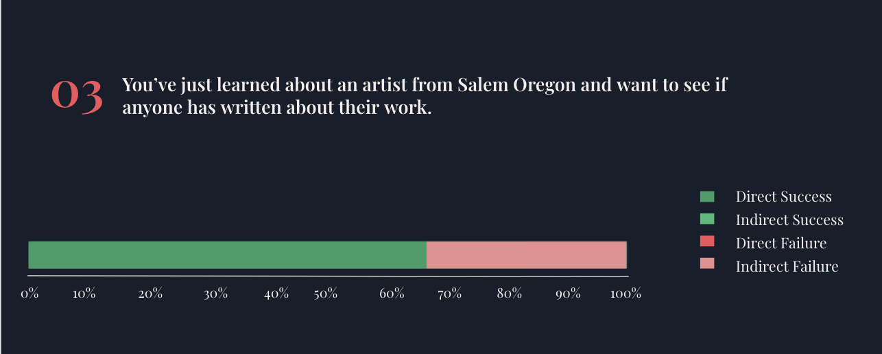
Information Architecture
The results of our subsequent tree test were positive as 74% of all tasks completed by participants ended with the “correct” response. In addition, all tasks also resulted in a 74% score for directedness as participants only backtracked 26% of the time.
The task that was the most difficult for users was the one pertaining to the “Love Letters” category. While users were able to start this task correctly, most were thrown off by the final step when they encountered the term “Love Letters”.
Redesigning Variable West
Original Layout
The original landing page before our redesign was a basic grid of all available events ordered chronologically, with no way to filter for relevant content other than a global keyword search.
Our user research indicated several priorities for our redesign.
Our user research indicated several priorities for our redesign.
Design Priorities:
- Establish event filtering by content type, location, and accessibiity criteria
- Suggest featured events within specific cities to help users find relevant content
- Allow users to map event locations relative to their location and to related events
- Restructure the site navigation experience for clarity
- Establish a minimalist aesthetic inspired by art galleries and artistic portfolios
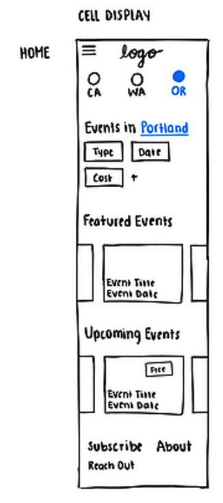
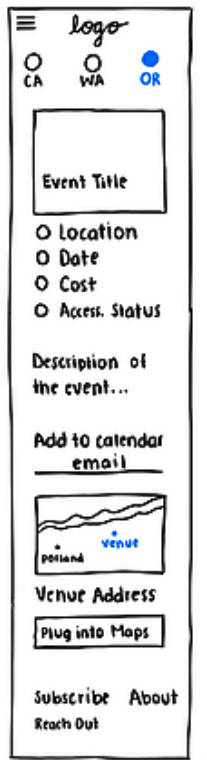
Back to the drawing board:
Paper Prototypes
Drawing from our research insights, we set out to rethink the limits of what Variable West could be. Unencumbered by the Wordpress templates our clients had been using, we drew out our initial sketches for the site.
Once we had developed our first round of prototypes on paper, we tested them with users on the Marvel app.
Considering form and function:
Medium Fidelity Prototypes

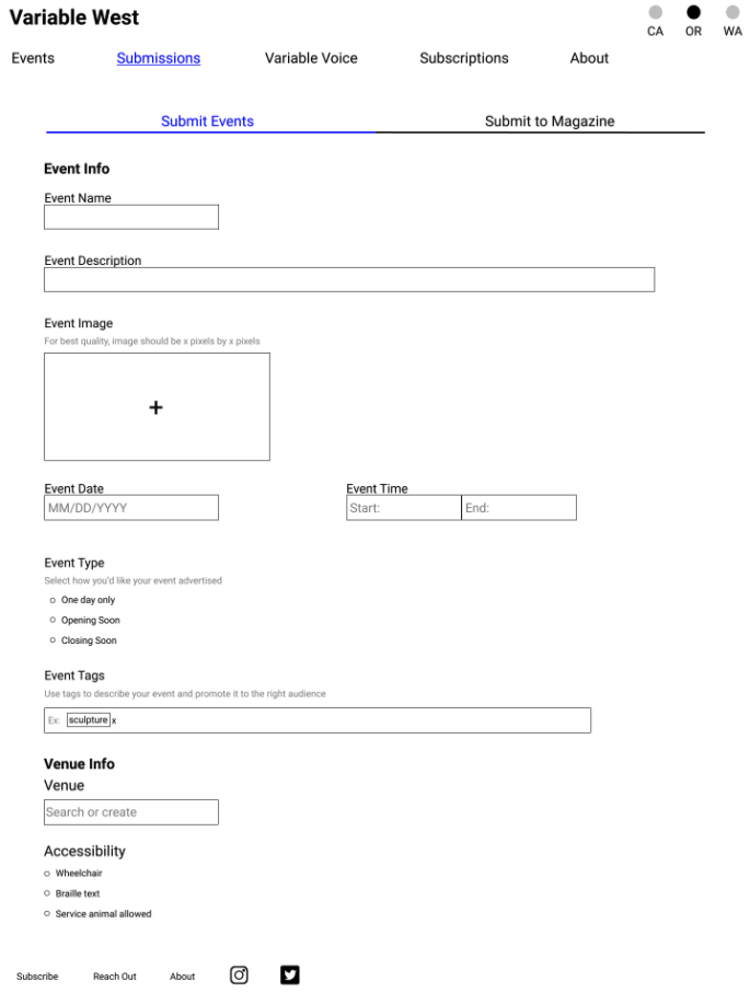
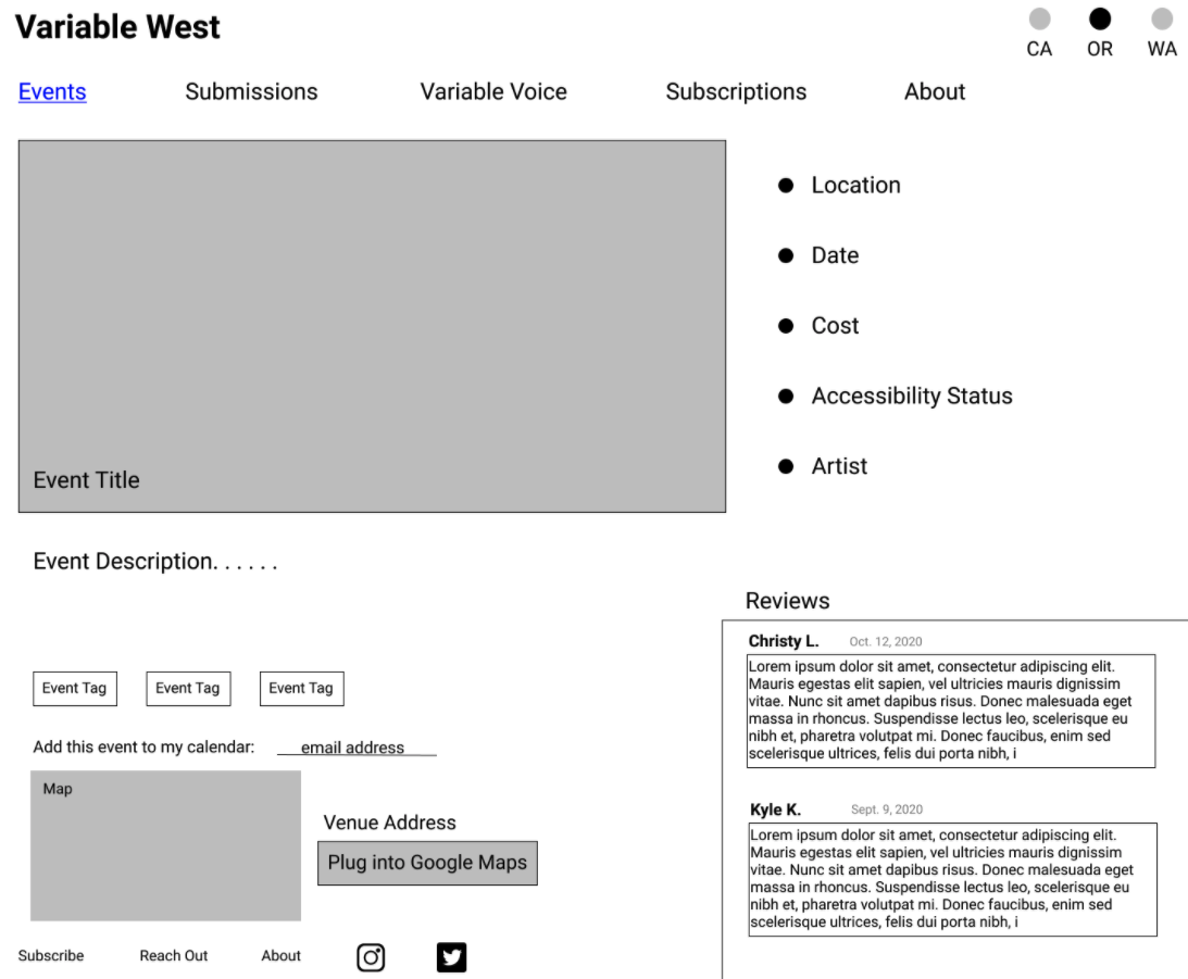
At this stage, we experimented with several new features amd user flows, including event reviews, article comments, and submission pages for content creators.
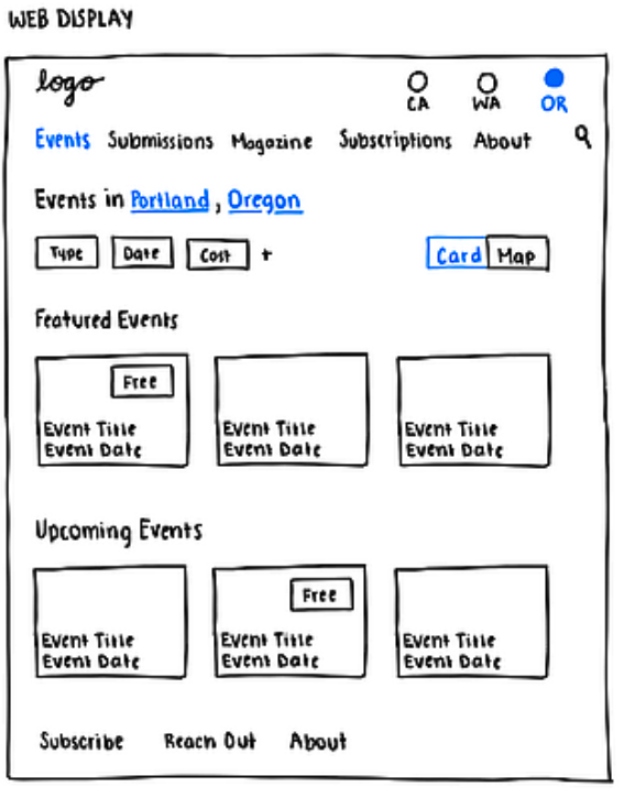
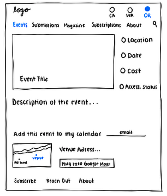
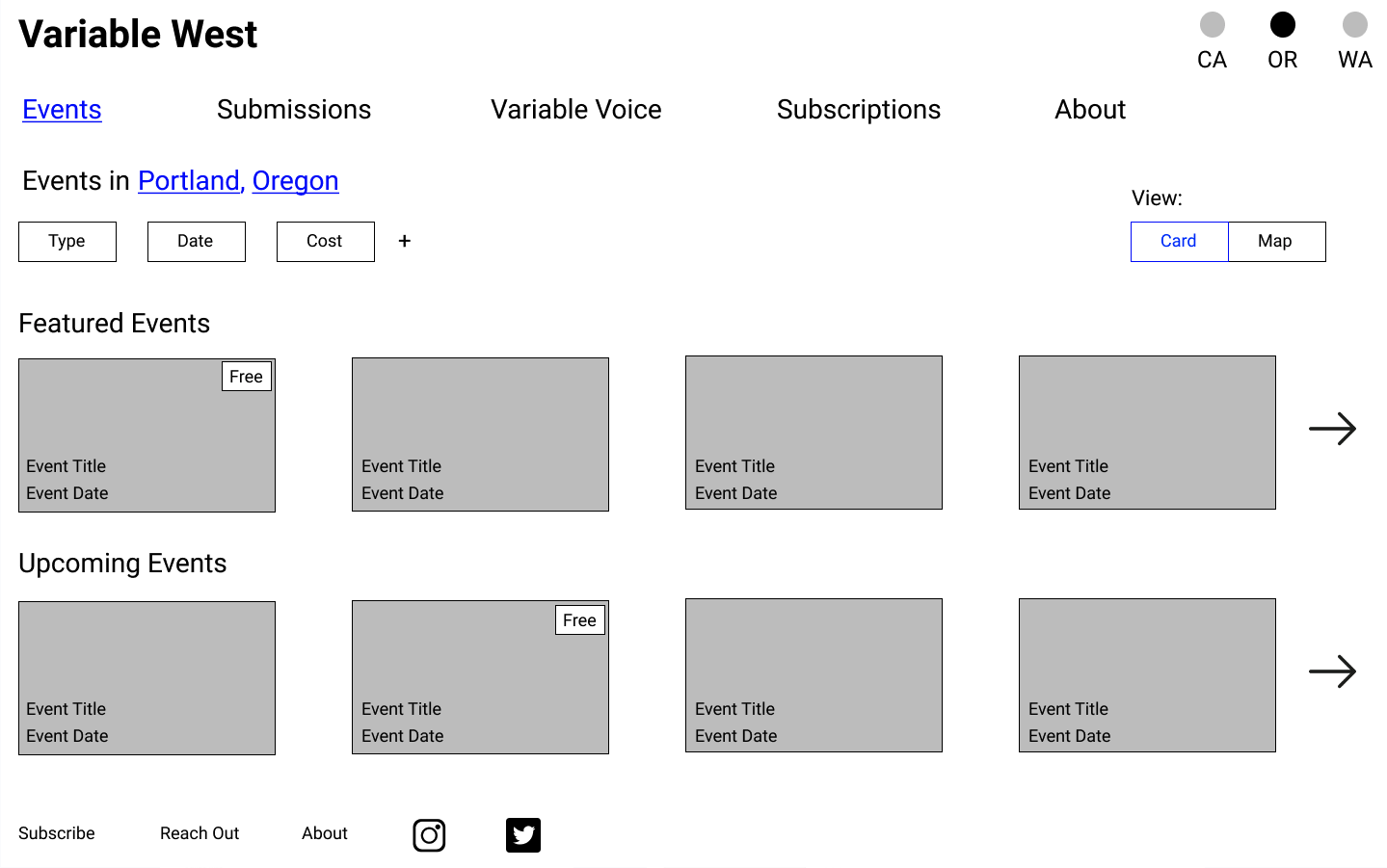
Pulling it all together:
High Fidelity Prototype
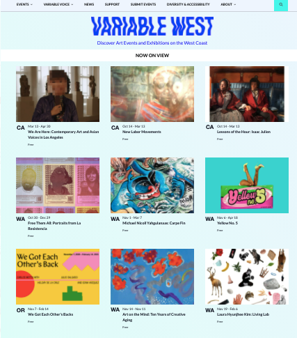
With the final version of the site, we incorporated feedback from our client to remove certain aspects of the mid-fidelity like user reviews and comments. The creators intended the site to feel more like a magazine than online community. After experimenting with several visual designs, the client selected a minimalist look and feel for the site. We reworked the site membership page and established subscription tiers based in our research insights. Additionally, we added pages to allow content creators to submit reviews and essays for moderation.
Selected screenshots: