🏛 The Metropolitan Museum of Art
What gets users’ attention?
Using an eye tracking lab to improve interactive digital features
Presented at INFO SHOW 2022
Eye Tracking Study

Abstract
As one of the world’s premier art museums, New York’s Metropolitan Museum of Art houses the largest collection of fine art in the United States. The Met’s website makes this collection available for a global audience and provides multimedia content to educate visitors about topics in art history. Unable to rely on more commonplace evaluation methods available to them, the Met’s digital product team reached out to the Pratt Institute’s Center for Digital Experiences to conduct an eye tracking study.
This eye-tracking usability study evaluated two aspects of the Met’s website that present content is markedly different ways: the interactive Close Look articles and the digital collection experience. As a result, we identified key findings and developed design recommendations which we ultimately presented to the Met’s digital product team.
This eye-tracking usability study evaluated two aspects of the Met’s website that present content is markedly different ways: the interactive Close Look articles and the digital collection experience. As a result, we identified key findings and developed design recommendations which we ultimately presented to the Met’s digital product team.
🗝 Methods used:
-
Eye-Tracking (Tobii Pro Lab)
- Moderated Usability Testing
- Prototyping (Adobe Illutrator, Figma)
- Recruitment (Google Forms, Calendly)
Over the course of a four week study, my team of five researchers set out to investigate:
Close Look Articles:
The Digital Collection Experience:
- How effective are these pages at guiding visitors through interactive essays that combine dynamic text and imagery?
The Digital Collection Experience:
- How do users engage with the collection pages when finding art by browsing or executing a targeted search?
User Screen Capture:
Close Look Article: Great Women Artists
www.metmuseum.org/perspectives/articles/2021/7/great-women-artists🏋️ My Role:
- Interviewing stakeholders at the Met to determine project goals and scope
-
Recruiting and screening participants
- Designing interview format and tasks
-
Moderating 2 eye-tracking usability tests
-
Taking notes for 3 sessions
- Collecting and analyzing data
-
Developing key findings, problem list, and highlight reel
-
Prototyping design recommendations
-
Creating slide deck and presenting to stakeholders

Generating heatmaps from Tobii Pro
What is eye tracking and why do we use it?
To generate insights and recomendations, we executed an eye tracking study using Tobii Pro in Pratt Institute’s usability lab. Tobii is a powerful tool for experimental research design that tracks participants’ eye movements to determine exactly where they are looking within a given stimulus -- in our case, the Met’s website.
Tobii’s biggest benefit is that it allows us to know exactly where users are visually fixating on screen. It indicates where they look and for how long, showing us attention-grabbing aspects of the site, as well as each user’s unique reading patterns. Conversely, it also lets us know what content visitors ignore.
Tobii’s biggest benefit is that it allows us to know exactly where users are visually fixating on screen. It indicates where they look and for how long, showing us attention-grabbing aspects of the site, as well as each user’s unique reading patterns. Conversely, it also lets us know what content visitors ignore.
Meeting with the Met’s team
My team and I met with members of the Met’s digital product team in late October 2021 to determine our research priorities. Before our meeting, they provided their research questions. Over the course of our conversation, we distilled their priorities into the following:
Close Look Articles:
Digital Collection Experience:
Close Look Articles:
-
How do readers consume and prioritize the text and visual content within the article?
-
Are articles successful in guiding a user’s visual focus? How so?
- How does the Met’s Close Look experience compare with similar content types? (like that of the New York Times)
Digital Collection Experience:
-
How do users identify and engage with artwork, information about these pieces, and the interface elements within the collection search?
-
What, if any, differences can be seen between users searching for a specific artwork versus generally browsing?
- How does the experience of browsing the collection search compare with the experience of the Art Institute of Chicago’s Collection Search?
Experimental design
To evaluate these areas, I recruited ten participants with a demonstrated interest in the arts and a familiarity with museum websites to complete three tasks during their testing sessions.
Each session began with a short calibration for the Tobii X2 eye tracking tool, followed by the three tasks which I have included below. After participants had completed these, our team walked them through a retrospective think-aloud activity in which we showed them the video from their tasks with the results of their eye-tracking and asked them to narrate what they were thinking or experiencing during the study to generate qualitative insights.
After the retrospective think-aloud, we concluded each session with a post-test questionnaire, asking for their feedback about the tasks with a series of questions to generate a System Usability Scale score (SUS) for these pages.
Task 1: Browse this Close Look article as you normally would (5 minute limit).
Task 2: Browse through the digital collection to learn about an artwork that interests you (5 minute limit).
Task 3: Imagine you are studying Pablo Picasso at school and looking for his artwork drawn using Graphite in a Cubist style. Identify a piece that meets this criteria and learn more about it using the digital collections search.
Qualitative Data:
- Behavioral observations
- User insights from moderated user test and retrospective think-aloud activity
- Post-test questionnaire
Quantitative Data:
-
Areas of Interest (AOI)
-
Time of Interest (TOI)
-
Heatmaps
-
Fixation points
-
Gazeplots
- System Usability Score
Part 1:
Close Look Articles
Close Look Articles
A participant’s gaze path and fixations as they navigate the Close Look page.
Our team observed that users bounced between text and images rapidly as the text pointed out highlights and specific details. The text clearly drew users to investigate the art more thoroughly.
As users scrolled through the Close Look articles, they enjoyed how the text pointed out aspects of the art shown on screen, and the image would scale to highlight specific details.
We used Tobii’s Areas of Interest feature to determine the time intervals users spent looking at the text and images. They predominantly focused on text content.
![]()
User Quotes:
“It was interesting how when the text was referencing a part of the piece…it would kind of zoom in on that. It’s not like you have to look for it, they’re already showing you it. I like that as well. It allows for better understanding.”
– Participant A
“[Here, the text] references “vigor and force” so I looked at [the image] to find out – can I see the vigor and force?”
- Participant OL
We used Tobii’s Areas of Interest feature to determine the time intervals users spent looking at the text and images. They predominantly focused on text content.

User Quotes:
“It was interesting how when the text was referencing a part of the piece…it would kind of zoom in on that. It’s not like you have to look for it, they’re already showing you it. I like that as well. It allows for better understanding.”
– Participant A
“[Here, the text] references “vigor and force” so I looked at [the image] to find out – can I see the vigor and force?”
- Participant OL
Finding:
Users lose interest quickly
“I moved my head here because I was starting to get tired of reading. I probably would have paused here had I not been doing this for you guys. It just felt like a lot of scrolling at this point.”
– Participant O
Our participants noted that they lost interest quickly due to the long scroll. There is no discernible way for users to discover how much farther they have to go until the end of the page, and were tired of scrolling before even getting halfway through the content.
User scrolling through the article
Mockup of the progress bar, to the right of the screen
Recommendation:
Add a progress bar with navigation control
To give users a better sense of the content they can expect to encounter throughout the article and indicate their relative progress toward completing the page using content headings, we propose adding a progress bar that hovers toward the page margin.
We envision that visitors could use this tool to scroll more quickly through the page, and find their desired content without having to work quite as hard to get there.
Finding:
Participants were unsure of how to begin reading the article.
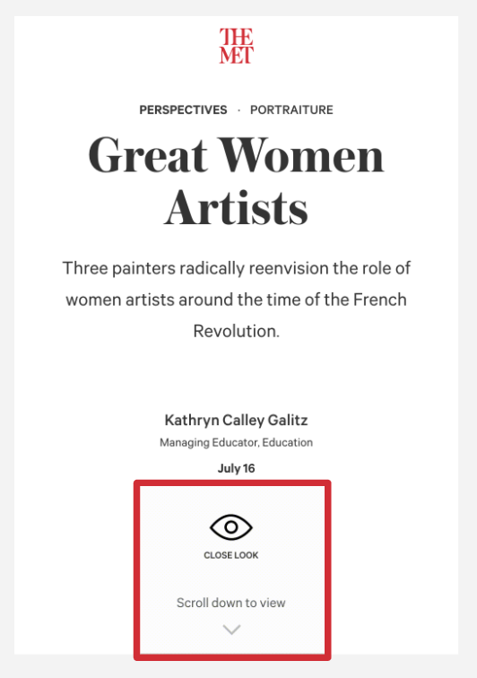
As demonstrated by the two images to the right, users had a hard time realizing that they needed to scroll to access the article.
“It took me about 2 minutes to understand what was going on (regarding content). I didn’t see that initial white box that told me to scroll.”
– Participant A
“Clearly I barely registered ‘Great Women Artists’ even though it clearly says it there. I may have read it but it didn’t sink because there was a lot going on there.”
– Participant O
“I couldn’t scroll down to view. I think it was the wrong direction, but it felt like a static page”
– Participant S
(not interactive)
(not interactive)
 Current version
Users were stumped by the page layout, distracted by irrelevant content.
The Close Look icon was perceived to be interactive, but is not. Users who clicked on this icon were immediately frustrated. Given where the icon is located on the page, they assumed it would take them somewhere.
Users need an indication to scroll.
Our participants glossed right over or did not notice the instructions to scroll – a key aspect of the page – likely due to the relatively small size, thin font weight, and low contrast text.
Recommendation:
Provide a familiar experience.
To prevent users from burning out early into their visit and bouncing, it’s important that the site meets the users’ expectations. A good start would be to reconsider the visual hierarchy of these icons.
The Close Look icon should be moved higher on the page to indicate that it is a specific type of content. If clicked, it should take users to similar content as they expect it to.
Given that I oberved users both ignoring the instructions to scroll and clicking on them, I propose that the Met make this an interactive icon and increase this icon’s visual weight. It is currently lighter than the rest of the content, which led users to assume it was not a key part of the page. In reality, it is the most important aspect of this initial landing page. If clicked, it could automatically advance users below the fold -- beginning them on their journey through the site.
Reference from the New York Times
The Met initially asked us how their Close Look pages compared to interactive content from The New York Times, so I referred them to this page.
To indicate that an article is meant for scrolling, the NYT inserts photo content that passes beyond the fold, providing a useful hint for users.
For an even more impressive look, parallax scrolling can add depth and make the page more immersive.
The landing page,
redesigned
I built this updated version which incorporates the progress bar from our previous design recommendation.
In addition, the landing page now features a cascade of images pulled from the article, giving users a helpful preview of what content to expect.
The images situated at the bottom of the page along with the navigation bar indicate that users can continue ther visit by scrolling into the article.
Redesigned Close Look landing page
After concluding the Close Look section of our study, our focus shifted to:

Screen capture of The Met’s Digital Collections page
Part 2:
The Digital Collections Experience
Screen capture of The Met’s Digital Collections page
Observation:
Users relied heavily on the search bar and filters to find art.
These areas became a key focus of our findings and recommendations for the collections pages.
“As soon as I started, I used search ‘cause it was easier when searching within a catalog. I tend to do that when websites provide it.”
– Participant S
Finding:
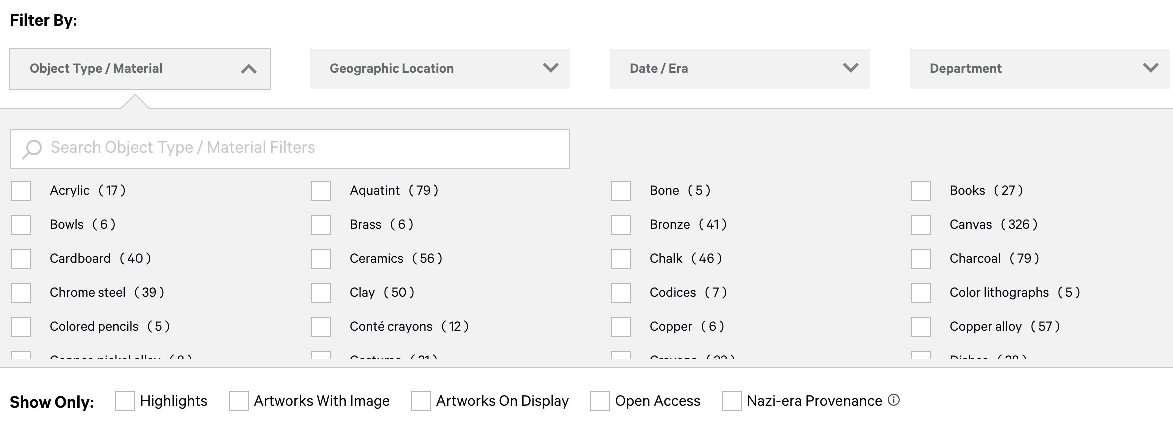
It’s not easy for users to locate relevant filters.
Heatmap of the filters takes on a rotated F-shaped reading pattern.
Users struggled to find the Graphite filter.
Even though there is a secondary search bar to help users find desired filters, only 50% of participants used it. To find filters, most skimmed vertically even though the filters are ordered alphabetically horizontally.
“I didn’t notice graphite was there. I would imagine going down alphabetically instead of across.”
– Participant AL
Recommendation:
Improve the filter design
Mockup of a redesigned filter layout.
Because participants struggled to locate the filter for graphite, we recommend redesigning the filter layout using vertical alphabetical columns and anchor tags so that users can find their selection in a more intuitive way.
Finding:
Users want more categories to filter content

Current filters
We found that our participants struggled to find content that excited them or matched their query, for categories like color, style, artist, etc.
[I’m filtering for] “paintings, but I didn’t see that specifically.”
– Participant A
“I was looking for ‘Artists’ ‘I wanted to see if there was a category for ‘big artists.” (within the “Art” dropdown)
“I was looking at era…. I expected to find something like ‘cubism’ there.”
“Was there something that I missed here? Like is there a ‘cubism’ filter?”
– Participant O
“I was wondering if there was an advanced search, where I could add another query (looking for Picasso specifically) but then I thought it would work if I just searched for ‘cubism Picasso.’”
– Participant OL
Recommendation:
Add filter categories
To help users narrow down their search, we propose referring to the Art Institute of Chicago’s list of filters in their collection search (to the right). If users were able to filter by more criteria, they reported that they would be able to find what they were looking for more easily.
Proposed redesign
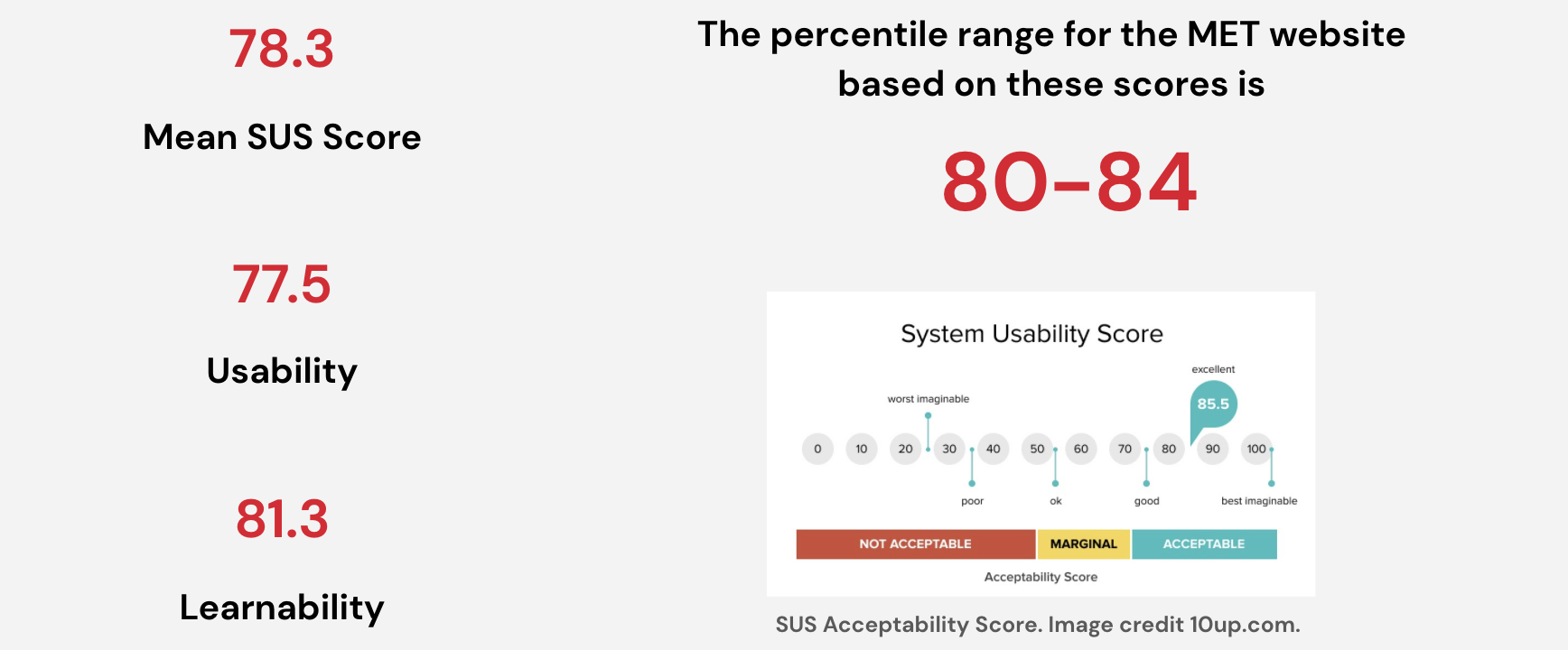
System Usability Scale (SUS)

The System Usability Scale is a popular tool used to numerically represent usability.
In our post-test questionnaire, we asked participants a series of standardized questions using a likert scale to calculate this score for the pages involved in our study.
The result was very positive, indicating that the site performs well and participants rated its usability highly.
Wrapping up
As a result of our eye tracking experiment, we know that participants enjoyed both the Close Look articles and digital collections search feature on the Met’s website. Their feedback during the retrospective think-aloud activity and their responses to the post-test questionnaire reflect a positive usability score.
However, as we demonstrated in our design recommendations, the Metropolitan Museum of Art could still improve these pages by implementing some straightforward changes.
`The most rewarding part of this project for me personally was the chance to use eye tracking tools to investigate how users engaged with Close Look content. The dynamic interplay between text and images makes it nearly impossible to use other testing methods to address the questions our client posed at the outset. Using Tobii, however, we were able to identify the ratio of time participants spent between reading the text and investigating the images, as well as the specific patterns and trends they exhibited when bouncing between the text and imagery.
Given that the Close Look pages are a relatively new feature, the Met’s team was very interested to hear our findings to see how they can improve these articles in the future. It will be interesting to see how they incorporate our findings and recommendations moving forward in upcoming interations of the site.


Client presentation 12.17.2021