🗞 Pratt Institute News
Heatmapping and
Web Analytics Study
Web Analytics Study
Is Pratt News easy to navigate?
Using analytics to learn about user behavior on an editorial website.
Abstract
Pratt News is a resource for current events, updates, and other relevant content within the Pratt community. It features a unique navigation menu that sets it apart from the rest of the Pratt Institute website. In this project, our team used web analytics to help users find content and get around the site more intuitively. Our main focus areas were the navigation menu, search bar, suggested
content layout, and the call to action buttons.
My team of five graduate students collaboratively analyzed trends in the data, took individual ownership of specific findings, and mocked up visualisations of of design recommendations to present for our client.
My team of five graduate students collaboratively analyzed trends in the data, took individual ownership of specific findings, and mocked up visualisations of of design recommendations to present for our client.
🔧 Tools Used:
🏋️ My role:
- Google Analytics
- Hotjar
🏋️ My role:
- Design and implement study
- Collect and analyze quantitative data
- Develop recommendations and design mockups
- A/B test design
Pratt News’ site:

news.pratt.edu
Knowing where to look
🔮
We prioritized four main research areas:
Users rely on the navigation menu to get around
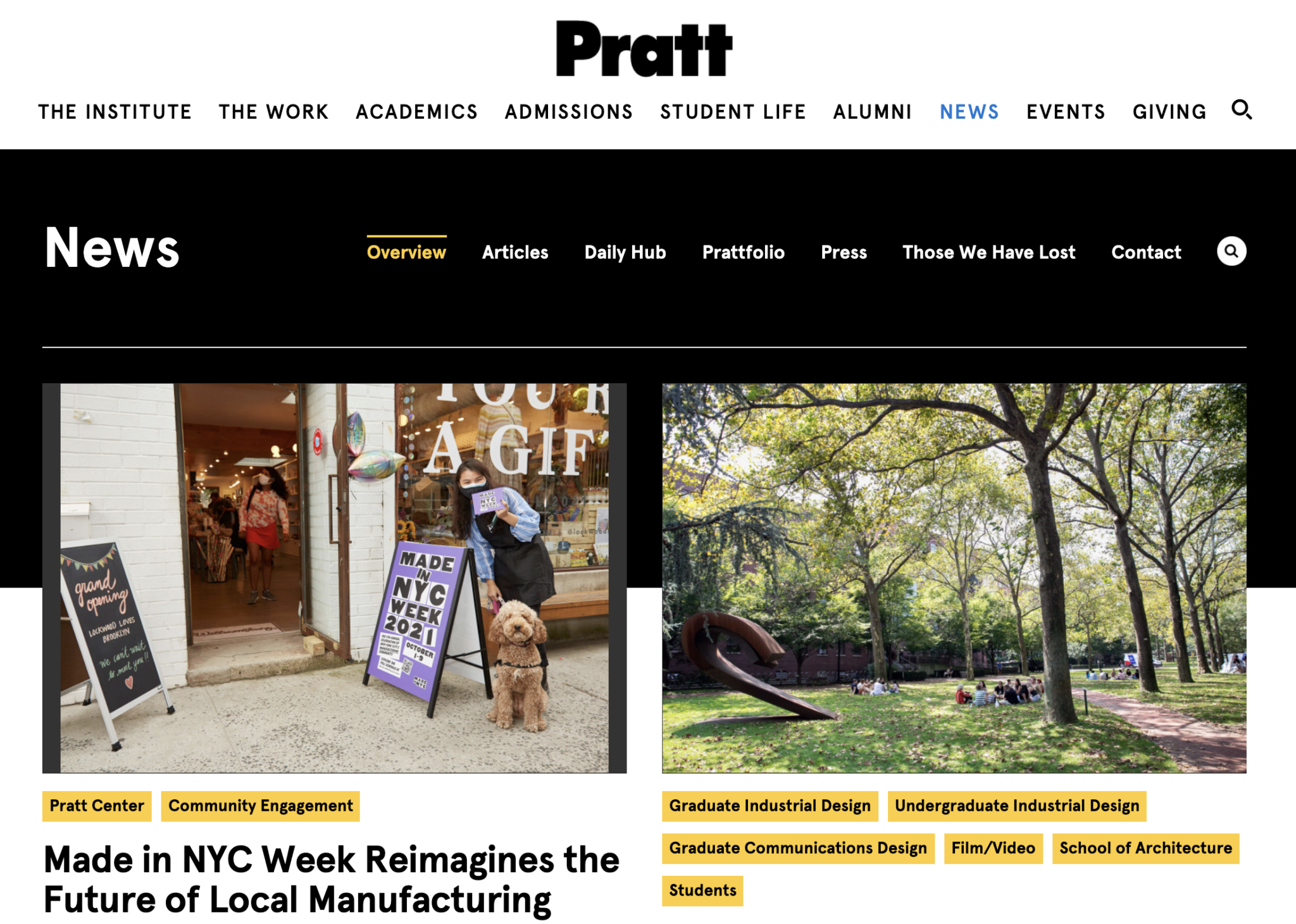
![]() Click heatmap: navigation menus
Click heatmap: navigation menus
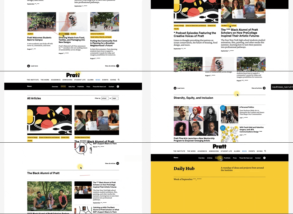
![]() Screen capture: user scrolling to browse before using the navigation bar
Screen capture: user scrolling to browse before using the navigation bar
![]()
Scroll heatmap: >75% of users reach these article descriptions
Who is interested in improving Pratt News’ navigation?
Our clients at Pratt News, Sarah Hromack and Alex Weiss Hills from the digital communications team (director and lead developer, respectively), are currently in the process of redesigning the entire Pratt Institute website. Our goal was to propose data-driven recommendations that could be implemented in the next iteration of news.pratt.edu.
In this study, we limited our scope to focus on site navigation. This is because Pratt News has a seperate, secondary navigation menu distinct from the rest of the site. By helping users find engaging and relevant content on Pratt News (and understanding the main pain points on the site) we hope to reduce the bounce rate.
Our presumed users include current students, faculty, alumni, prospective students, and other members of the Pratt community.
Knowing where to look
🔮
We prioritized four main research areas:
- Navigation Menus
- Search Bar
- “Suggested Content”
- Call to Action Buttons
We used Google Analytics to understand how users currently engage with the site and drew insights from trends we discovered in the data. Specifically, we additionally used Hotjar — a tool that allows researchers to visualize user behavior in the form of click and scroll heatmaps. Our team collected data between September 24th through September 30, 2021 to formulate our study.
To learn how to best help Pratt News users, we had to first define our study’s priorities and scope to draw meaning out of the data. We limited our inquiry to desktop browsers and looked into most notable aspects of site navigation to identify research topics which we then split up to study individually.
Given that Pratt News has its own secondary navigation menu in addition to the primary global navigation bar, our team broadened our project scope to consider how both navigation menus may supplement one another.
Users rely on the navigation menu to get around
 Click heatmap: navigation menus
- We first looked into the two navigation menus and found that 43% of all users use the navigation menu to find their way around the site.
- A large majority of users scroll beneath the end of the first visible page, known as the “fold” (83%). To navigate the page, users scroll back up again to the navigation bar.
 Screen capture: user scrolling to browse before using the navigation bar
Scroll heatmap: >75% of users reach these article descriptions
To prevent users from dropping off due to the scroll, we suggest implementing a sticky navigation bar. If the navigation menu is always present for users (even as they scroll down to read articles), there is no need to scroll up to the top of the page to reorient oneself. To minimize confusion, we suggest folding the global site navigation into a hamburger menu so that it is minimized but still accessible for users.
As seen in the mockup below, the navigation menu can disappear as users scroll down. If users scroll up at all, the navigation bar immediately reappears, without making users scroll all the way to the top of the page.
As seen in the mockup below, the navigation menu can disappear as users scroll down. If users scroll up at all, the navigation bar immediately reappears, without making users scroll all the way to the top of the page.
Recommendation #1
A sticky navigation bar
A sticky navigation bar

Visualization: simulating a sticky navigation menu that reappears upon scrolling. Global navigation folds into a hamburger menu.
Prevent the search bar from obscuring the navigation menu + add suggestive search.
![]()
![]()
When the search icon is selected, the search bar obscures the entire navigation menu.
Recommendation #2
Prevent the search bar from obscuring the navigation menu + add suggestive search.


When the search icon is selected, the search bar obscures the entire navigation menu.

 Heatmaps: search is the single most popular (red) item on the site.
 My individual focus for this stage of research was looking into how Pratt News might improve their search bar. In our initial analysis, we discovered that the navigation menu was the most popular area for user clicks, but we encountered a challenge almost immediately — the Pratt News navigation menu is entirely obscured when users click on the search icon!
This is particularly problematic because the search icon is the single most clicked item on Pratt News. This meant that the two most engaging areas of the site were in direct conflict with one another. This likely contributed a phenomenon we noticed: the vast mahority of users who clicked with the search bar did not follow through with a search.
To solve this issue, the search bar should open beneath the navigation menu as seen below.
 My solution mockup: dropdown search bar
I found in our initial data analysis using HotJar that 6.6% of all website visitors clicked on the search bar. However, when compared against Google Analytics data of completed searches, I noticed that there was a significant dropoff of users who click on the bar — only 1.7% of all visitors actually completed a search.
This indicates that nearly 5% of all users drop off between opening the search bar and completing a search.
To address this issue, Pratt News’ team could implement a suggestive search feature to help users who click on the search icon by offering a list of recent or popular searches.
Empty space is wasted space
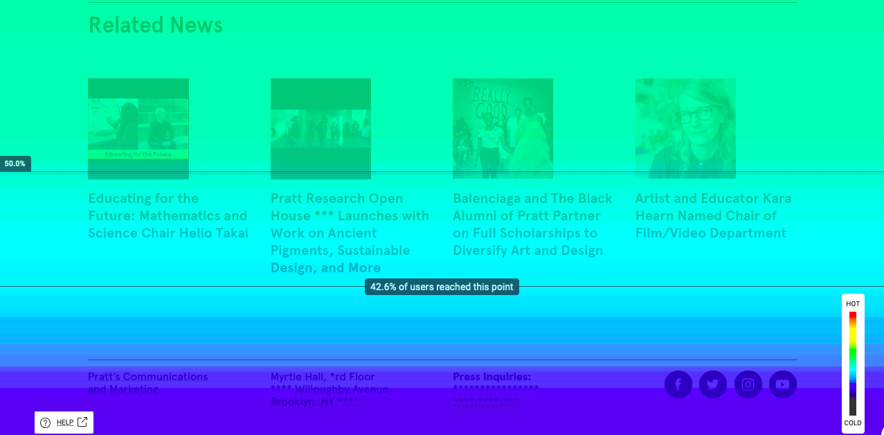
Turning away from the navigation menu and looking further down each page, we found that most users drop off before reaching important content, the “related news” links.
An average of 46.8% of desktop users see linked “Related News” at the bottom of each article page, with a range of 34% - 64%. This is a missed opportunity for presenting them with relevant information that would otherwise feed engagement.
To address this issue, we suggest relocating this content from the bottom of the page to a more prominent position. Site visitors wouldn’t need to scroll to the bottom of each article to find related articles and may be more likely to explore more content this way.
 Scrollmap: only about 42% of users reach “Related News” content
Recommendation #3
Replace blank space in the sidebar with “Related News” so that users don’t miss it.

A/B testing
🚥
To follow up on the results of this project, I designed an A/B test to test the hypothesis if our third recommendation. We expected that, by moving the Related News section to the right-hand bar of the desktop version, Pratt News could increase user engagement with articles across the site.
One of our key findings was that only about 46% of desktop users find “Related News” content. To address this issue and reduce the number of users who drop off from the article page, we proposed a page redesign to relocate the “Related News” section higher -- in the blank space to the right of the written content.
I proposed that by implenting an A/B test that moves “Related News” to this prominent position, more users will find these links and engage with them, lowering the bounce rate, increasing the number of total page views, and lengthening the average amount of time users spend on Pratt News.
I built the test using Google Optimize, and look forward to hearing the results as Pratt’s digital team implements it to help with their pending site redesign.
Client Insights and Reflections
👩🚀🚀🌒
After presenting our findings and recommendations to Sarah and Alex from Pratt’s Digital Communications team, they agreed with our concerns and confirmed that they would consider these areas when redesigning the site. They did have a question about responsive design — whether our third recommendation would still apply on mobile devices. Because we limited our study to desktop users, the recommendation wouldn’t apply in this case; the mobile version of the site doesn’t have blank space in the sidebar. It would be impossible to relocate “Suggested Articles” to this area. Otherwise, our findings hold true for mobile users.
In all, it was a pleasure to put together this research for Pratt’s Digital Communications team on this project! My teammates and I were confronted by several obstacles when using Google Analytics, and had a lot of fun exploring Hotjar for heat-mapping and scroll-mapping. Together, these tools will be helpful in future projects to determine the necessary metrics for executing further research and present findings in a persuasive and intuitive way to clients.
In all, it was a pleasure to put together this research for Pratt’s Digital Communications team on this project! My teammates and I were confronted by several obstacles when using Google Analytics, and had a lot of fun exploring Hotjar for heat-mapping and scroll-mapping. Together, these tools will be helpful in future projects to determine the necessary metrics for executing further research and present findings in a persuasive and intuitive way to clients.